Top Marketplace UI/UX Design Best Practices
13 min
read
Discover essential UI/UX design tips for marketplaces to boost user engagement and sales effectively.


Marketplace UI/UX design best practices are harder to apply than standard e-commerce UX because there are two distinct user types, buyers and sellers, with fundamentally different goals. The platform must serve both simultaneously without compromising either.
A checkout that optimises for buyer speed may frustrate sellers who need listing control. This guide covers the specific design patterns, conversion decisions, and trust signals that make marketplace interfaces work for both sides.
Key Takeaways
- Dual-sided design is the core challenge: Buyers and sellers have different mental models and different success metrics. The platform must serve both without treating one as secondary.
- Trust signals drive conversion more than aesthetics: Reviews, verification badges, response rates, and transaction counts are decision-making inputs, not decoration. Their placement determines whether buyers complete transactions.
- Search UX is the primary revenue lever: Platforms where buyers cannot find relevant listings in under three interactions lose most of those buyers permanently. Search is not optional.
- Mobile-first is the baseline: 70% or more of consumer marketplace transactions originate on mobile. Designing desktop-first and adapting to mobile produces measurably worse conversion outcomes.
- Onboarding friction reduces supply quality: Every additional required field in seller onboarding reduces completion by 5-15%. Friction at the top of the funnel compounds across the entire vendor base.
- Progressive disclosure reduces abandonment: Show buyers the minimum information needed to decide at each step. Reserve detailed content for users who have signalled intent, not all users at all times.

What Makes Marketplace UI/UX Design Different from Standard Web Design?
Marketplace design presents unique challenges compared to standard websites or e-commerce because it must serve two distinct user types with different goals, within the same interface, without degrading the experience of either.
In standard e-commerce, one audience and one goal define every design decision. In a marketplace, every screen must be evaluated against both buyer and seller perspectives simultaneously.
- The dual-sided design problem: Sellers want maximum listing visibility and data access. Buyers want minimum cognitive load and fast discovery. These goals conflict at multiple design decision points.
- Trust as a conversion variable: In standard e-commerce, brand recognition builds trust. In a marketplace, trust must be built transaction-by-transaction through verification signals, reviews, and social proof between strangers.
- The empty state problem: Marketplaces depend on listings to deliver value to buyers. Before supply reaches critical mass, the UX must manage thin inventory honestly. A sparse category page is bad; falsely curated empty categories are worse.
- Multi-journey complexity: A marketplace has at least three distinct user journeys (buyer search-to-purchase, seller onboarding-to-listing, admin moderation) that must all be coherent within the same platform.
- The off-platform leakage risk: Marketplace users can take transactions off-platform. The UX must create enough value in the on-platform experience that neither party wants to bypass it.
User flow complexity in a marketplace is higher than any single-audience product. The design process must account for all three journeys before a single screen is drawn.
How Should You Approach the Marketplace Design Process?
The marketplace design process follows a fixed sequence: dual user research, then user flow mapping, then wireframing, then trust signal research, then prototype testing. Skipping or reordering steps produces a design that works for one user type and frustrates the other.
Before committing to visual design, the marketplace wireframing and prototyping process establishes user flows and interaction patterns at low cost and low risk.
- Dual user research first: Interview buyers and sellers separately. Seller interviews focus on listing creation friction and trust requirements. Buyer interviews focus on discovery behaviour and decision triggers. Do not combine them.
- User flow mapping before wireframes: Map the complete flow for each user type before drawing a single screen. The buyer flow (entry, search, filter, listing page, trust evaluation, payment) and seller flow (registration, listing, management, payout) must both be coherent.
- Wireframe the critical paths first: The listing page, search results, checkout, and seller onboarding are the conversion-critical screens. Getting these right early saves significant revision cost downstream.
- Test trust signal placement: Where reviews, verification badges, and transaction counts appear in the buyer journey should come from user research and testing, not design assumption. Most tested marketplaces show the highest conversion impact above the fold on the listing page.
- Prototype testing before development: An interactive prototype tested with 5-8 users on each side will surface more UX problems at $5,000-$10,000 cost than fixing those problems in a live product at $50,000-$100,000 cost.
The five-step process is not a waterfall. Each step produces findings that feed back into earlier stages. Budget for at least one cycle of revision between user research and wireframing.
What Does Best-Practice Buyer UX Look Like in a Marketplace?
Best-practice buyer UX covers four distinct layers: homepage and entry, search and results, listing page, and checkout. Each layer has specific design requirements that drive conversion at that stage of the buyer journey.
Each sub-area below is a distinct conversion stage. Weaknesses in any one layer reduce conversion throughout the funnel below it.
Homepage and Entry UX
The homepage is the first conversion decision a buyer makes. Curated listings above the fold, category navigation that reflects buyer thinking (not seller categorisation), and social proof at entry establish immediate credibility.
A clear separation between "buy" and "sell" entry points prevents buyer confusion on first visit.
- Curated listings above the fold: Featured listings chosen for quality or relevance, not random or newest, give buyers immediate evidence of supply quality and platform curation.
- Buyer-centric category navigation: Category structures that reflect how buyers search (by use case or need) convert better than structures that reflect how sellers organise their inventory.
- Social proof at entry: Transaction counts, verified seller counts, or review highlights visible on the homepage establish platform credibility before a buyer has seen a single listing.
Homepage UX sets the buyer's quality expectations before they interact with any listing. A homepage that signals low curation quality reduces conversion throughout the session, not just at entry.
Search and Results UX
Search results UX is the most direct driver of buyer conversion. Default sort by buyer intent relevance (not newest listing or highest-rated seller), faceted filtering accessible without scrolling, and listing cards that lead with images and price are the baseline requirements.
Pagination is preferred when buyers are in evaluation mode. Infinite scroll reduces bounce rate for discovery-mode browsing.
- Faceted filtering above the fold: Price range, category, ratings, and availability filters should be visible without opening a drawer on desktop. Hidden filters are filters that do not get used.
- Listing card hierarchy: Thumbnail image (dominant), price (visible without hovering), seller rating (visible), key attribute (one or two lines). Everything else creates noise that reduces click-through.
- Filter persistence on navigation: Applied filters must survive pagination and back-navigation. Losing filters when a buyer returns from a listing page is among the leading causes of search abandonment.
Search results UX directly determines how many buyers find what they came for. Platforms that invest in search UX see measurable GMV improvement that compounds as the vendor base grows.
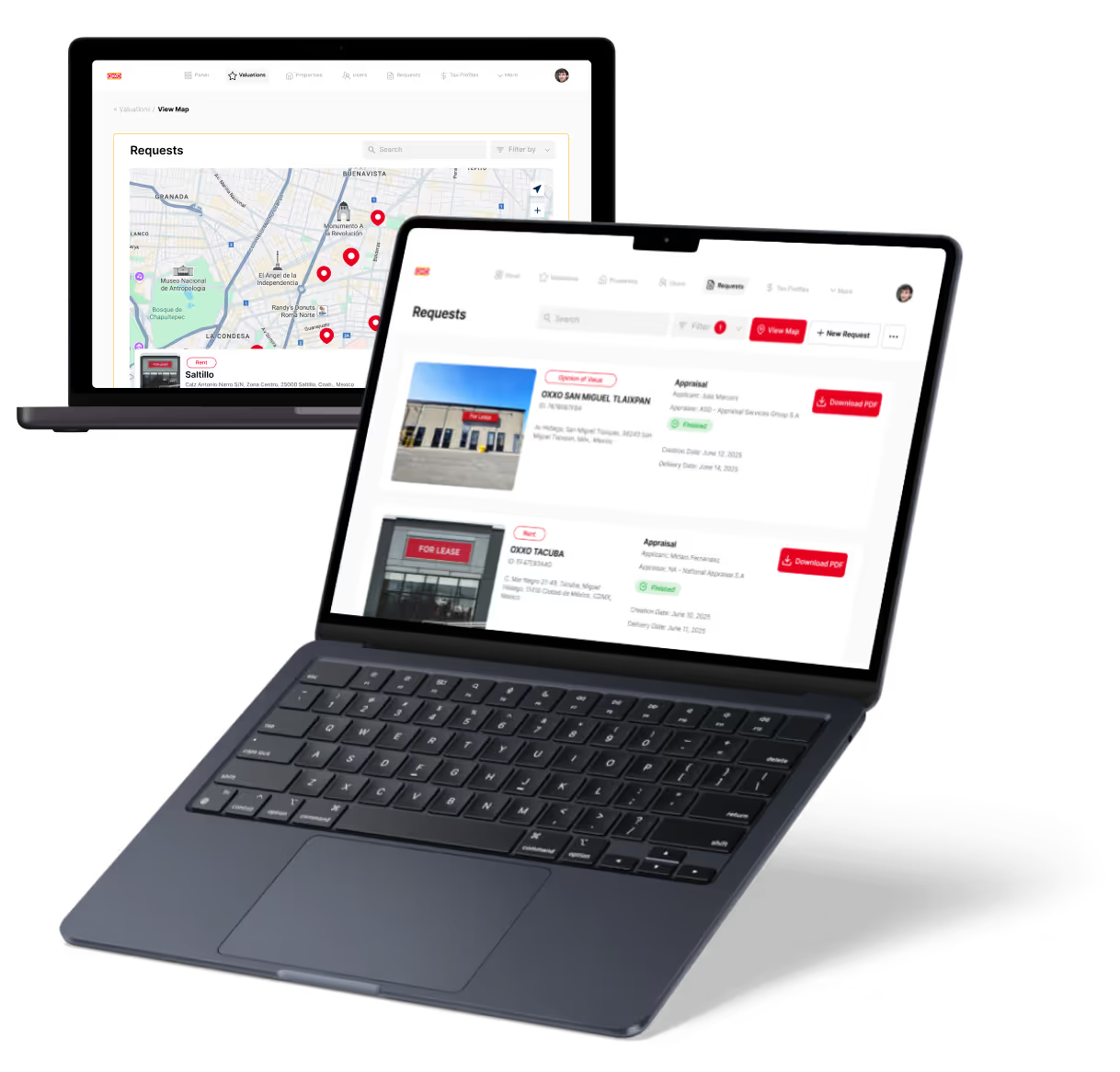
Listing Page UX
The listing page is where the buyer's trust decision is made. Trust signals must appear above the fold, before images, price, or description. The primary CTA (Buy, Book, or Request) must be visually dominant and sticky on scroll.
The secondary CTA (message seller) should be visible but not competing with the primary action.
- Trust signals above the fold: Seller verification status, ratings summary, response time, and transaction count placed above the fold increase conversion more than any other single listing page change in tested marketplaces.
- Image gallery as primary content: Marketplace buyers make faster decisions from images than from text descriptions. The image gallery should dominate the listing page layout on both desktop and mobile.
- Price anchoring signals: Showing similar listings or market average price near the primary price reduces buyer hesitation by providing context for the value of the listed item.
The listing page is the highest-value page to optimise in any marketplace. Session recording on listing pages consistently reveals the specific trust or information gaps that prevent purchase decisions.
Checkout UX
Guest checkout availability, a progress indicator for multi-step checkout, trust signals at payment, and a persistent order summary are the four non-negotiable checkout UX requirements.
Requiring account creation before purchase increases abandonment by 20-40%.
- Guest checkout for first-time buyers: First-time buyers who are forced to create an account before paying abandon at significantly higher rates. Guest checkout captures first transactions that convert to accounts post-purchase.
- Progress indicator: A visible step count (step 2 of 3) reduces abandonment by setting buyer expectations about how much remains before the transaction is complete.
- Trust signals at payment: Secure payment badges and platform guarantee messaging at the payment step address the moment of highest buyer anxiety in the transaction flow.
A complete breakdown of buyer-facing features and their UX requirements is covered in the buyer panel design best practices guide.
What Does Best-Practice Seller UX Look Like in a Marketplace?
Best-practice seller UX covers four distinct layers: onboarding, listing creation, seller dashboard, and performance visibility. Seller UX quality determines how many sellers complete onboarding, how many listings they create, and whether they stay on the platform.
Each sub-area below is a distinct part of the seller experience that directly affects supply quality and quantity.
Seller Onboarding UX
Progressive onboarding, a visible completion progress indicator, preview mode, and a guided first listing experience are the four critical elements of seller onboarding UX.
Sellers who can see their completion progress are 30-40% more likely to complete onboarding than those who see only a form.
- Progressive onboarding structure: Ask for the minimum information required to create a first listing. Collect additional profile and verification information after the first listing is live.
- Preview mode before publishing: Allowing sellers to see how their listing appears to buyers before publishing reduces poor-quality listings and the support overhead that comes with them.
- Guided first listing experience: Tooltips, example content, and placeholder text reduce the blank-page problem for new sellers who have no reference point for what a strong listing looks like.
Onboarding completion rate is the leading indicator of supply quality. Below 50% completion signals a friction problem. Below 30% signals a structural onboarding design problem that requires immediate redesign.
Listing Creation UX
Category suggestion, image upload with quality guidance, pricing guidance using comparable listings, and auto-save every 60 seconds are the baseline listing creation UX requirements.
Sellers creating complex listings abandon if they lose progress. Auto-save is not optional.
- Category suggestion from title: Suggesting the correct category based on listing title keywords reduces miscategorisation and the zero-result searches that follow from it.
- Pricing guidance at creation: Showing the price range for similar listings in the selected category anchors the seller's pricing decision and reduces under-priced or over-priced listings that hurt conversion.
- Image quality guidance: Minimum resolution requirements, framing suggestions, and rejection feedback at upload prevent poor-quality images from reaching buyers without requiring post-publication moderation.
Listing creation UX determines initial listing quality across the platform. The cost of improving listing quality after publication is much higher than preventing quality problems at the point of creation.
Seller Dashboard UX
Primary metrics above the fold (views, enquiries, sales, and earnings), order management with clear status indicators, payout visibility (balance, next payout date, and history), and per-listing performance data are the four required seller dashboard elements.
Sellers who cannot see when they will be paid are the most common source of dashboard-related support tickets.
- Above-the-fold metric summary: Views, enquiries, sales, and earnings are the four numbers that tell a seller whether their listing strategy is working. These must be visible on dashboard load, not buried in a sub-menu.
- Clear order status indicators: Sellers should never need to contact the platform to understand the current status of a transaction. Ambiguous status labels are the primary cause of "what is happening with my order" support tickets.
- Per-listing performance visibility: Which listings are generating views and conversions, and which are not, is the most actionable data a seller has. Providing it reduces the platform's burden of improving listing quality centrally.
The specific features and interaction patterns that make seller dashboards effective are covered in the vendor dashboard UX patterns guide.
How Do You Design Marketplace Search and Filtering for Conversion?
The technical and UX architecture behind effective search and filtering UX design in marketplace contexts is covered in the dedicated system design guide.
Search and filtering UX has the highest direct revenue impact of any element in a marketplace interface. The decisions made here compound across every buyer session on the platform.
- Persistent search bar placement: Search must be above the fold and persistent across all pages in inventory-rich marketplaces. Search is the primary navigation tool, not a secondary option.
- Autocomplete with category and seller suggestions: Autocomplete reduces zero-result searches by 30-40% by guiding buyers toward existing inventory before they commit to a query that returns nothing.
- Always-visible priority filters: Price range, category, ratings, and distance filters should be visible without opening a drawer on desktop. The most-used filters that require a tap to access are filters that do not get used consistently.
- Filter persistence on back-navigation: Applied filters must survive pagination and the back button. Losing filter state on back-navigation is a leading cause of search abandonment. This specific failure is common and consistently underestimated in its revenue impact.
- Dynamic filter counts: Showing how many listings each filter value returns, updated in real time, prevents buyers from selecting filter combinations that return zero results and then abandoning the search entirely.
- Zero results alternatives: "No results" pages must offer relaxed search suggestions, related categories, or "notify me when available" options. A dead end at zero results is a permanent buyer exit in most cases.
Default sort order matters as much as filter design. "Recommended" based on relevance should be the default, not "Newest" or "Highest rated." Default sort should reflect what buyers are most likely to want on first encounter with search results.
How Do You Measure and Improve Marketplace UX Performance?
The frameworks for measuring and improving UX performance are covered in the marketplace conversion rate optimization guide.
Moving from design intuition to data-driven improvement requires specific metrics and testing frameworks, not general conversion rate tracking.
- Search-to-listing-view rate: What percentage of searches result in at least one listing page view? Below 40% signals a search or filter UX problem that is costing the platform a majority of search-initiated sessions.
- Listing-view-to-intent rate: What percentage of listing views result in a contact, save, or purchase action? Below 5% for product marketplaces signals a trust or listing quality problem on the listing page.
- Seller onboarding completion rate: What percentage of sellers who start onboarding publish at least one listing? Below 50% indicates friction in the listing creation flow that is reducing supply volume.
- Checkout abandonment rate: What percentage of buyers who reach checkout do not complete the transaction? Above 70% signals a checkout UX problem requiring specific investigation.
- Mobile versus desktop conversion delta: If mobile conversion is more than 30% lower than desktop, the mobile UX requires targeted attention. This gap rarely closes on its own.
The most valuable qualitative research method for marketplace UX is post-abandonment buyer interviews. Understanding why non-purchasers left produces more actionable findings than understanding why purchasers stayed. Session recording (Hotjar, FullStory) identifies where buyers stop scrolling, where they click unexpectedly, and where they exit before those patterns show up in aggregate conversion metrics.
Conclusion
Marketplace UX design is not about making a beautiful interface. It is about reducing friction on both sides of a transaction between strangers.
The trust signals, search experience, and onboarding flow are not features to optimise after launch. They are the primary determinants of whether buyers and sellers transact on your platform. Identify the single screen with the highest exit rate, run session recordings for one week, and conduct five buyer interviews about that screen specifically. The findings will be more actionable than any further design theory.
Designing a Marketplace? The UX Decisions That Affect Revenue Are Made in the Design Phase, Not After Launch.
Most marketplace UX problems are not discovered until after launch, when fixing them means rebuilding screens that are already live with real users. The trust signal placement that was assumed to be correct turns out to suppress conversion. The checkout that seemed simple enough turns out to have a 75% abandonment rate. Post-launch redesigns cost five to ten times more than getting the design right before development begins.
At LOW/CODE Agency, we are a strategic product team, not a dev shop. We conduct dual-sided user research, design trust-forward UX patterns, and build marketplace interfaces that have been tested with real users on both sides before a line of production code is written.
- Dual user research: We interview buyers and sellers separately to map distinct mental models, decision triggers, and friction points before any design work begins.
- User flow mapping: We map the complete buyer and seller journeys, including all edge cases and empty states, before wireframing a single screen.
- Critical path wireframing: We wireframe the listing page, search results, checkout, and seller onboarding first, because these screens have the highest revenue impact per design decision.
- Trust signal design and testing: We design and test the placement, format, and content of trust signals on listing pages, so conversion impact is measured before launch, not assumed.
- Search and filter architecture: We design search and filtering UX with filter persistence, dynamic counts, and mobile-first interaction patterns that are tested against real buyer behaviour.
- Prototype testing before development: We test interactive prototypes with 5-8 users on each side before committing to development, catching UX problems at a fraction of post-launch remediation cost.
- Full product team delivery: Strategy, UX design, development, and QA from a single team, so the marketplace ships as a coherent dual-sided product rather than a buyer app with a seller portal added on.
We have built 450+ products for clients including Coca-Cola, American Express, and Sotheby's.
If you are designing a marketplace and want the UX to be right before development begins, let's scope it together.
Related Articles
Last updated on
June 30, 2026
.

Jesus is a visionary entrepreneur and tech expert. After nearly a decade working in web development, he founded LowCode Agency to help businesses optimize their operations through custom software solutions.

FAQs
What are key UI elements for a successful marketplace?
How can UX design improve buyer trust in a marketplace?
What role does mobile optimization play in marketplace design?
How should product listings be designed for better user experience?
What common UX mistakes should be avoided in marketplace design?
How can personalization enhance marketplace user experience?
Related Articles

Marketplace
How to Build a Service Marketplace Platform
Learn key steps and tips to create a successful service marketplace platform with ease and efficiency.

Marketplace
How to Build a Staffing Marketplace Platform
Learn key steps to create a successful staffing marketplace platform with practical tips and essential features for smooth operation.

Marketplace
How to Build a Luxury Resale Marketplace
Learn key steps to create a luxury resale marketplace, from sourcing products to ensuring authenticity and attracting high-end buyers.

Marketplace
Subscription Marketplace Business Model Explained
Learn how subscription marketplace models work, their benefits, challenges, and how to start one effectively.

