

How to Review Webflow Design Mockups Effectively
Most clients review Webflow mockups wrong. Here's how to give feedback that improves the design without derailing the build.

Knowing how to review Webflow design mockups effectively protects your project budget and timeline. Most clients approach design review the wrong way: focusing on personal taste rather than whether the design achieves the brief, which leads to expensive revision cycles and delayed launches.
This article gives you a practical framework for reviewing Webflow mockups at each stage, consolidating feedback from multiple stakeholders, and approving designs in a way that keeps the build on track.
For expert Webflow development services, LOW/CODE Agency delivers fast, conversion-focused builds for businesses ready to move off template platforms.
Key Takeaways
- Review against the brief, not your taste: The question is not "do I like this?" but "does this achieve the goals we defined in discovery?"
- Mockups are not finished sites: Static designs do not show interactions, responsiveness, or live content: factor that into your feedback scope.
- Consolidate feedback before submitting: Multiple stakeholders sending separate, contradictory comments is the single biggest cause of revision spirals.
- Be specific about what the issue is: "I don't like the header" is not actionable; "the header text is too small at mobile sizes" is.
- Approve in phases, not all at once: Approving wireframes before visual design and desktop before mobile reduces rework and ambiguity.


Why are Webflow design mockups different from traditional web mockups?
Understanding why Webflow mockup review is more consequential than in traditional web projects changes how seriously clients take the approval process.
The question of how Webflow design differs from theme-based or traditionally coded approaches is the context that explains why visual design decisions made in mockup review are significantly harder to change after development begins.
- Direct translation to build: In Webflow, the design is built in the same environment as the live site. A design decision made in Figma becomes a production decision in Webflow with minimal translation overhead, which means corrections are more expensive, not less.
- Visual design decisions are harder to change post-development: Structural layout changes, type size adjustments across a design system, and color changes that affect multiple components each require revisiting already-developed sections.
- Static mockups versus interactive prototypes: A static mockup does not show scroll behaviors, hover states, or mobile breakpoints. Clients who base their approval solely on static mockups are approving an incomplete picture.
- Staging preview versus final design: A staging build preview shows development-stage fidelity, which may differ from the final approved design in ways that require a second review cycle if not expected.
What should you check in a Webflow design mockup?
A practical review checklist prevents the most common approval oversights that create post-development revision requests.
- Goal alignment: Does the homepage layout direct user attention toward the primary conversion goal? Does the pricing page make the decision process clear? Review each page against the goal it was designed to serve.
- Visual hierarchy: Is the most important content: headline, CTA, social proof: visually prominent without competing equally with secondary content? Poor hierarchy is the most common design flaw in business websites.
- Brand consistency: Fonts, colors, and visual language should be consistent across all pages and match the brand guidelines provided at the brief stage.
- Content fit with real content: Ask the agency to replace placeholder text with real content, or provide your own content for review. Designs that work with lorem ipsum sometimes fail with actual product descriptions or case study text.
- CTA placement and visibility: Every page should have a clear, visible primary CTA. Check that it appears before the fold on desktop and within the first scroll on mobile.
What makes feedback useful vs. harmful during a design review?
The quality of feedback you give in a design review determines how much of the revision budget you consume.
For a detailed guide on how to give structured design feedback throughout the entire build process, a dedicated article covers the full feedback framework across every project phase.
- Objective feedback: Based on the brief, user goals, or measurable outcomes. "The CTA is below the fold on mobile, which will hurt our demo request conversion rate" is objective feedback.
- Subjective feedback: Based on personal preference or emotional reaction. "I feel like it needs to be more exciting" gives the designer nothing to work with: thereis no design decision that answers the question.
- Frame feedback as problems, not prescriptions: "The pricing table doesn't make the difference between plans clear" is more useful than "change the pricing table to a three-column layout." The designer may find a better solution than the one you would have prescribed.
- Examples of useful versus harmful feedback:
`html
| Harmful feedback | Useful feedback |
|---|---|
| "I don't like the colors" | "The blue background in the hero section is not in our brand palette: ourbrand blue is #0052CC" |
| "Make it more modern" | "The body font is too traditional for our positioning as a tech brand: can we explore a more geometric alternative?" |
| "The layout doesn't feel right" | "The testimonial section is too far down the page for first-time visitors to see it: can we move it above the feature grid?" |
| "It needs to pop more" | "The primary CTA button doesn't have enough contrast against the white background to meet WCAG AA contrast requirements" |
`
How do you consolidate feedback from multiple stakeholders?
Unconsolidated feedback from multiple stakeholders simultaneously is the most reliable way to generate a revision cycle that costs three times what a consolidated round would have.
- Appoint a single decision-maker per review round: One person collects, reviews, reconciles, and submits feedback to the agency. That person has final authority on contradictory internal opinions.
- Use a shared annotation tool: Figma comments, Markup.io, or Pastel allow stakeholders to attach feedback directly to the relevant design element, making consolidation faster and more accurate than email threads.
- Set internal review timelines: Give stakeholders 24 to 48 hours to submit feedback to the review owner. Feedback that arrives after the internal deadline goes into the next revision round, not the current one.
- Resolve conflicts before submitting: When two stakeholders want different things, the feedback owner makes the call internally. The agency receives one instruction, not two contradictory ones.
- What happens when feedback is submitted without consolidation: An agency receiving ten separate email threads with conflicting direction must pause, escalate for resolution, and wait: creating delays that cascade into every dependent development task.
How should you approach mobile and tablet design reviews?
Mobile review is the most consistently skipped step in design approval and the most expensive omission to correct after development.
- Why mobile review is skipped: Most stakeholders review designs on a laptop and forget that the majority of their users will be on a phone. The agency may present only desktop mockups unless mobile review is explicitly requested.
- What to look for on tablet and mobile layouts specifically: CTA visibility in the first viewport, text readability without zooming, tap target size for interactive elements, and image quality at smaller sizes.
- How interaction behaviors differ across breakpoints: A navigation menu that works as a full-width dropdown on desktop typically becomes a hamburger menu on mobile: review the mobile navigation interaction explicitly, not just the visual layout.
- Request a separate mobile walkthrough: For complex designs, ask the agency to present the mobile layouts in a dedicated session rather than as a small thumbnail at the end of a desktop review.
- Common mobile design issues found too late: Overlapping text and images at tablet breakpoints, CTA buttons too small to tap comfortably, and hero sections that lose their visual impact on a small screen are all addressable during design review and expensive to fix post-development.
Why does good feedback save money?
The relationship between design review quality and project cost is direct. Every revision cycle has a cost, and the cost of a revision increases at each subsequent project phase.
Understanding how feedback affects project costs at each phase gives buyers the financial context to treat design review as an investment activity rather than a bureaucratic checkpoint.
- Design changes versus post-build changes: A typography change requested during design review takes thirty minutes. The same change requested after the developer has built thirty pages using that typography may take a full day.
- How revision cycles inflate budgets: Most agency contracts include two to three revision rounds per phase. Using all of them on the first page delays the review of subsequent pages and compresses the timeline for everything that follows.
- What out-of-scope revision rounds cost: Additional revision rounds beyond those included in the contract are typically billed at $800 to $1,500 per day equivalent. One unnecessary revision round can cost as much as a day of development.
- Using feedback discipline to stay within budget: Clients who review against the brief, consolidate feedback, and resolve internal conflicts before submitting consistently complete projects within their revision budget.
How do enterprise teams manage design reviews effectively?
Enterprise organizations face additional review complexity that requires structured governance rather than informal approval processes.
The enterprise design review process used by experienced enterprise Webflow agencies includes governance frameworks that make multi-stakeholder approval repeatable and documented rather than ad hoc.
- Governance structures for design sign-off: Define in advance which stakeholders are approvers versus reviewers. Approvers have the authority to sign off; reviewers contribute feedback but do not hold approval authority.
- Parallel review tracks: Instead of sequential reviews: marketing first, then legal, then executive: run parallel review tracks with a defined consolidation meeting where conflicts are resolved before the single consolidated submission goes to the agency.
- Design review meetings versus async annotation: Complex enterprise designs often benefit from a synchronous design review meeting where the agency presents and stakeholders ask questions in real time, with async annotation used only for subsequent detailed feedback.
- Setting SLAs for internal feedback rounds: Define the expected turnaround time for each internal review round at the project start so stakeholders know when their input is required and project managers can hold them to the commitment.
What happens after you approve and why does that matter?
Approval is a commitment, not a milestone. Understanding what approval means in a Webflow project prevents the most common post-approval conflict.
Understanding post-approval costs and changes in the context of a Webflow project timeline helps clients see why approval given during development is far more expensive than a clear approval at the right review stage.
- What "approved" means in a contract: Approval means the agency can proceed to build the approved design. It does not mean "we can still change things if we reconsider."
- Change order processes and costs post-approval: Design changes requested after approval are processed as change orders at the agency's standard rate. A homepage layout change post-approval typically costs $1,500 to $3,000 in rework time.
- How late design changes affect development timelines: A design change during development requires the developer to pause their current work, implement the change, and then reconcile any downstream effects on related sections.
- Avoiding approval regret: A staged review process: wireframes first, then visual design, then staging preview: ensures that structural decisions are approved before visual decisions, and visual decisions before build decisions, dramatically reducing post-approval regret.
Effective design review is a skill. Clients who review against the brief, consolidate feedback internally, and approve in clear phases dramatically improve project outcomes and reduce costs. The review process is your primary opportunity to shape the final product.
Share the review checklist from this article with all internal stakeholders before your next design presentation. Setting review standards before the first design lands in your inbox is far easier than correcting the process after it has already caused a delay.
How LOW/CODE Agency Guides Clients Through Design Reviews
Most agency design presentations leave clients to their own devices when it comes to review. We take a different approach: we guide clients through review in a structured way that produces useful feedback and keeps projects on schedule.
At LOW/CODE Agency, we are a strategic product team, not a dev shop. Our design review process is built into every project phase so clients know exactly what they are reviewing, what good feedback looks like, and when they need to make decisions.
- Dedicated design walkthrough sessions: We present every design phase in a structured walkthrough that explains the decisions made and invites feedback on specific elements: nota document drop with no context.
- Phase-gated review structure: We review wireframes before visual design, desktop before mobile, and design before staging, so every approval is incremental and specific rather than holistic and overwhelming.
- Client feedback briefing: Before each review session, we brief clients on the scope of the review: whatthey should assess and what falls outside the current phase.
- Annotation tools as standard: We use Figma comments for design reviews and Pastel or equivalent for staging reviews so feedback is attached to specific elements, not buried in email threads.
- Single submission protocol: Our review process requires consolidated client feedback through a named feedback owner. We do not accept parallel feedback from multiple sources without consolidation.
- Brief compliance as the primary review criterion: We design every page against the goals and audience defined in discovery. Our review sessions begin by re-stating those goals so approval is measured against them.
- Mobile design presentation: Mobile and tablet layouts are presented alongside desktop in every design review, not as an afterthought once desktop is approved.
We have built 450+ products for clients including Coca-Cola, American Express, and Sotheby's.
If you want a design review process that keeps your project on time and on budget, talk to our team.
Last updated on
September 3, 2026
.

Daniel is a Web Developer at LowCode Agency who has been building websites in Webflow since 2022. With a background in graphic design, he turns the design team's concepts into fast, responsive sites built to scale.

FAQs
What are the key steps to review Webflow design mockups?
How can I spot common design errors in Webflow mockups?
What tools help in reviewing Webflow mockups more efficiently?
How do I ensure the mockup matches the client's requirements?
What common mistakes should I avoid when reviewing Webflow designs?
How often should Webflow design mockups be reviewed during a project?
Related Articles
Webflow
Website Redesign Stakeholder Interview Questions
The right stakeholder interview questions surface the information no brief can capture. Here are the questions that produce the most useful redesign insights.
Webflow
Webflow Forms and Lead Capture: What You Can Do
What Webflow forms can do natively, how to connect them to your CRM, and when you need a third-party form tool instead.
Webflow
How to Build User-Friendly Websites Using Low-code
Learn how to build user-friendly websites using low-code. Explore UX principles, responsive design, performance tips, and low-code tools that scale.
Comparison
Webflow
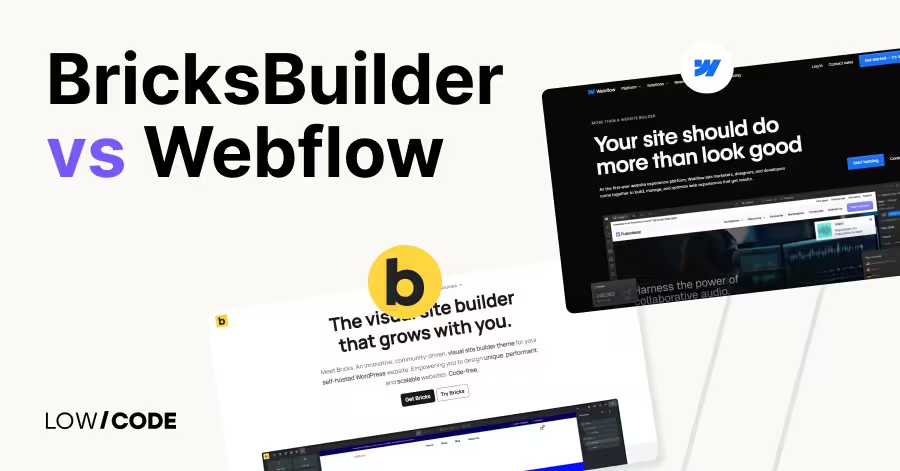
Webflow vs Bricks | 10 Factors to Decide the Best One
Compare Webflow vs Bricks across 10 key factors like design, CMS, SEO, and eCommerce to find the best platform for your next website project

Why customers trust us for no-code development


