How to Build a Financial Dashboard App with Bubble
9 min
read
Build a field service management app with Bubble no coding. Schedule jobs, dispatch teams, and track work orders step-by-step fast.


Finance teams run on data, but most still pull numbers from three different tools into a spreadsheet before every review. Building a financial dashboard app with Bubble centralises KPIs, charts, and real-time figures in one role-based view connected directly to your live operational data.
No data export, no ETL pipeline, no stale spreadsheet. Bubble queries your database directly and renders updated figures every time the page loads.
Key Takeaways
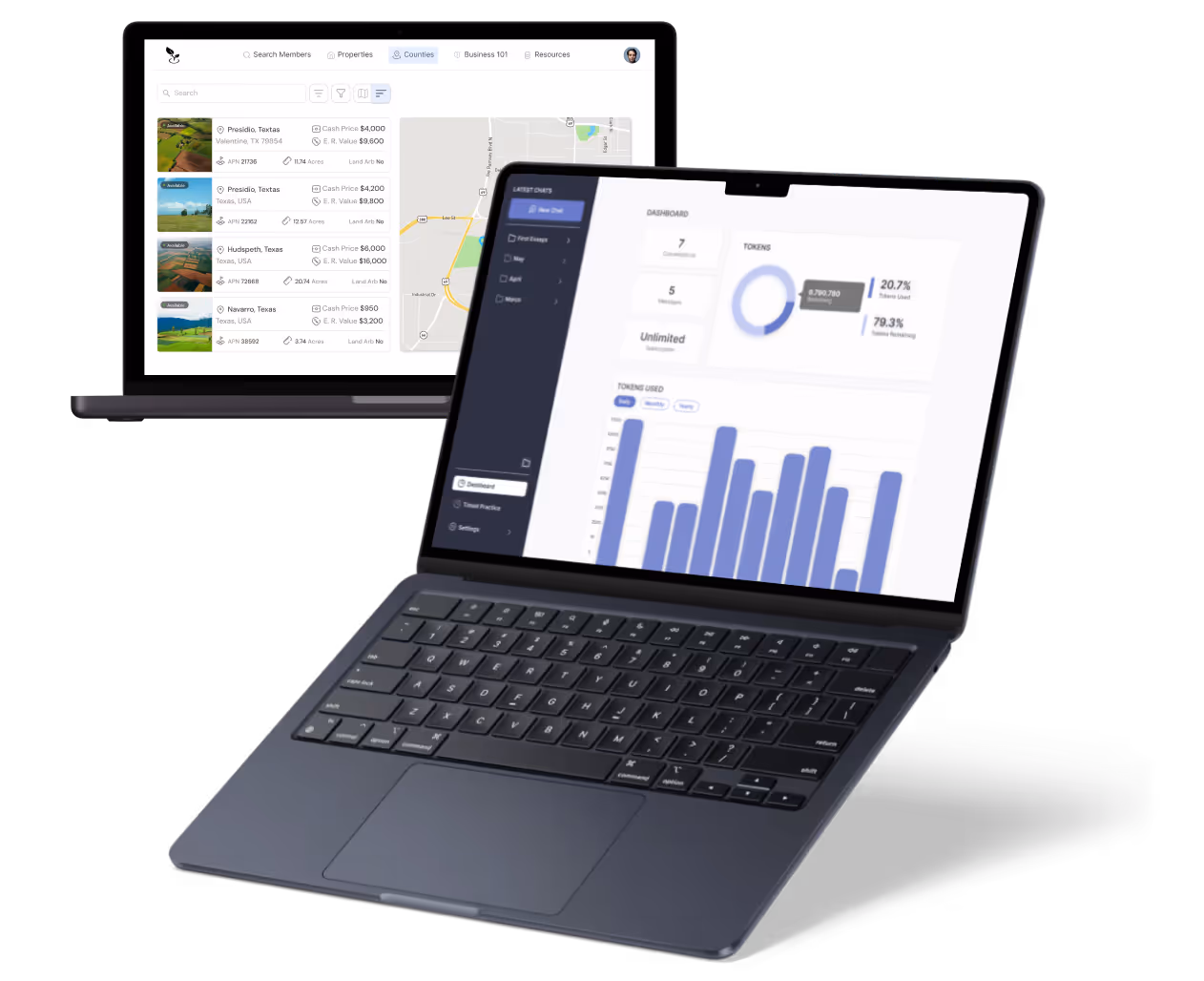
- Highcharts plugin is the charting engine: Bubble's native chart element covers basic bar and line charts; Highcharts unlocks advanced visualisations including area charts, gauges, and mixed chart types.
- KPI cards are driven by aggregated database queries: Revenue, expenses, and net figures display as calculated values from filtered database searches, not static numbers.
- Date range filters are state-based: Use Bubble's custom states to store the selected date range and feed it into all repeating groups and chart queries simultaneously.
- Role-based access controls what each user sees: Admins see all entities; managers see their department; read-only users see summaries only, enforced through Privacy Rules and conditional visibility.
- Real-time data requires thoughtful workflow design: Scheduled workflows or triggered recalculations keep KPI cards current without manual refresh.

What Is a Financial Dashboard App — and Why Build It with Bubble?
A financial dashboard app displays key financial metrics, revenue, expenses, profit, cash position, and outstanding invoices, in a real-time, role-appropriate view for each type of user.
Common use cases include CFO reporting dashboards, operations team spend trackers, SaaS revenue metrics views, and investor-facing financial summaries.
- Connected to live data: Bubble dashboards query your app's own database directly, no data export or separate BI tool connection required.
- Faster iteration: Drag-and-drop layout design in Bubble means dashboard changes take hours, not days of front-end development.
- Role-appropriate views: Different users see different data sets and chart configurations based on their role, all managed from one application.
- No separate analytics infrastructure: Data lives in Bubble's database and the dashboard reads it directly, no warehousing layer or ETL setup needed.
Review Bubble's charting capabilities and limits early. Knowing what the native chart element cannot do helps you decide whether Highcharts is needed from day one. Bubble's visual development environment lets teams design and test dashboard layouts in hours rather than days.
What Features Should a Financial Dashboard App Include?
A well-scoped financial dashboard covers KPI cards, trend charts, period filtering, and role-based access. Start with these components and add complexity after validating the core view.
Every feature below has a direct dependency on the data architecture. Scope the database first.
- KPI summary cards: Revenue this period, total expenses, net profit, cash balance, and outstanding invoices, each as a calculated text element driven by live database aggregations.
- Revenue chart: Monthly or weekly revenue displayed as a bar or line chart using the Highcharts plugin, with a date range selector to control the view.
- Expense breakdown chart: A pie or bar chart showing spending by category for the selected period, updated dynamically from the date range state.
- Profit and loss summary panel: Income minus expenses for the selected period, with a period-over-period comparison showing the delta and percentage change.
- Cash flow trend line: Inflows versus outflows over time as a two-line Highcharts chart. One of the most requested views for operations and finance leads.
- Outstanding invoice table: A list of unpaid invoices with client name, amount, and days overdue, displayed as a filtered repeating group.
- Date range filter: A date picker or dropdown using custom states to control all charts and tables on the page simultaneously.
- Role-based views: Separate dashboard layouts or conditional panel visibility for CFO, department managers, and read-only stakeholders.
The date range filter is the single most impactful feature to build correctly from day one. It drives every other element on the dashboard.
How Do You Structure the Data for a Financial Dashboard App in Bubble?
Dashboard performance depends directly on data architecture. A poorly structured database causes slow load times and inaccurate aggregations, both of which undermine trust in the dashboard.
Your core data types feeding the dashboard are Transaction, Invoice, Expense, Category, Department, and User.
- Transaction fields: Type option set (income or expense), amount, date, category link, department link, description, and linked Invoice or Expense record.
- Aggregation strategy: KPI card values use Bubble's "Do a search for" with sum or count operators. No separate summary table is needed for most dashboards.
- Date range state: A custom state of type date stored at the page level controls which date range all queries use; every search on the page references this state as a constraint.
- Performance planning: For large datasets with 10,000 or more records, adding date-indexed search constraints reduces load time significantly.
- Periodic snapshot records: For dashboards needing fast load on very large datasets, a MonthlySnapshot data type stores pre-calculated totals per period, updated by a scheduled workflow each month.
Understanding how Bubble scales with your data volume helps you decide whether live database queries or pre-calculated snapshots are right for your dashboard.
How Do You Build the Charts and KPI Cards in Bubble?
Each dashboard element is a distinct Bubble component with its own data source configuration. Build them individually and test each one against real data before assembling the layout.
The date range custom state is the first thing to build. Every other element depends on it.
- KPI cards using text elements: Set the text value to a dynamic expression using "Search for Transactions: sum of amount" with date range constraints pulled from the custom state.
- Highcharts plugin chart setup: Install the Highcharts plugin, place a Chart element, configure the data series as a list of values from a search, and set labels from a list of dates or categories.
- Monthly revenue chart: Search Transactions filtered by type "income" and the selected date range, group by month, and pass the list of totals to Highcharts as a data series.
- Expense category pie chart: Search Transactions filtered by type "expense," group by category, and pass category names and totals as a Highcharts series with matching colour values.
- Date range filter using custom states: Add a DatePicker input; on change, set custom states "date_from" and "date_to"; reference these states as constraints in every search on the page.
- Period comparison: Calculate current period total and previous period total as separate text elements; display delta and percentage change using Bubble's math expressions.
- Real-time update trigger: Use Bubble's "Data change" trigger or a page-level workflow to refresh chart data when a new Transaction is created in the database.
Build the date range state and one working KPI card first. Verify the number is correct against known data before building any charts or additional elements.
How Do You Set Up Role-Based Access for a Financial Dashboard in Bubble?
Role-based access on a financial dashboard is not just a UI concern. It needs to be enforced at the database level through Privacy Rules, not only through conditional element visibility.
A user who bypasses the UI should still only retrieve the data their role permits.
- Define roles as an option set: Create a User role option set with values for admin, CFO, department_manager, and viewer, assigned to each User record.
- Privacy Rules for data access: Restrict Transaction and Invoice searches to return only records matching the logged-in user's department; admins and CFOs get all records without department constraint.
- Conditional UI visibility: Use Bubble's conditional formatting on dashboard panels to hide or show specific KPI cards, charts, and tables based on the Current User's role field.
- Department-scoped views: Managers see a filtered version of all KPI cards and charts constrained to their department, handled by adding a department constraint to every search on the manager's view.
- Read-only viewer role: Viewers see summary KPI cards only, no transaction tables, no drill-down navigation, no export buttons visible in the UI.
Configuring Bubble privacy rules for dashboards at the database level ensures that even API requests respect role boundaries, not just the visible UI.
How Long Does It Take and What Does It Cost to Build a Financial Dashboard App with Bubble?
Dashboard scope ranges from a simple KPI view to a complex multi-role, multi-department reporting tool. Timeline and cost scale accordingly.
Plan the complexity tier before estimating. A basic dashboard and a full multi-role dashboard are different projects.
- Basic dashboard: KPI cards, 2–3 charts, and a date filter, 2–4 weeks solo, 1–2 weeks with an experienced Bubble developer.
- Full dashboard: Multi-role access, 6 or more chart types, department views, and data export, 5–8 weeks solo, 3–5 weeks with an agency.
- Bubble plan: Growth plan is recommended for dashboards with API workflows and multiple user roles; Starter may work for a simple single-role view.
- Plugin costs: Highcharts plugin is free; PDF or CSV export plugins add $10–$29/month; no additional data costs when using Bubble's native database.
- Agency cost range: $4,000–$12,000 depending on chart complexity, number of roles, and whether external data sources like accounting APIs or ERPs are connected.
- Performance optimisation scope: Pre-calculated snapshot workflows, pagination on large tables, and efficient search constraints each add build scope and cost but are essential for dashboards with large datasets.
Most dashboard projects benefit from starting with the KPI cards and date range filter. Validating that the data model supports the required aggregations, then adding chart complexity in a second phase.
Conclusion
Bubble enables a real-time financial dashboard when the data architecture is clean, date range filtering is built as a page-level custom state, and role-based access is enforced at the Privacy Rule level.
Define your KPI cards and their source data types first. Build the date range state and a single working chart before designing any additional layout.
Need a Financial Dashboard Built in Bubble That Actually Performs?
Most Bubble dashboard projects hit performance problems because the data architecture was not designed for aggregation queries. Role-based access applied only to the UI, not the database, is the other common failure.
At LOW/CODE Agency, we build AI-powered products for SMBs — custom web apps, mobile apps, chatbots, RAG systems, and AI agents, delivered with the depth and standards of a specialist software team. We design financial dashboards in Bubble with clean data architecture, Highcharts integration, date-range filtering, and role-based access that works at the database level, not just the surface.
- Scoping: We map every KPI, chart type, and role requirement before any database or workflow design begins.
- Database architecture: Transaction, Invoice, Expense, and snapshot data types are structured for efficient aggregation queries from the start.
- Workflow build: Date range state, KPI card expressions, Highcharts series configuration, and period comparison logic are built and tested in sequence.
- Plugin and integration setup: Highcharts plugin, CSV export, PDF generation, and any external API connections are fully configured.
- Testing: Every KPI card, chart, and role-based access restriction is tested against real data before delivery.
- Deployment: Privacy rules, role assignments, and performance testing on realistic data volumes are completed before go-live.
- Post-launch support: Documented architecture and available support for new KPIs, additional roles, or external data source connections.
We have built 450+ products for clients including Coca-Cola, American Express, and Medtronic.
Related Articles
- How to Build a Fleet Maintenance App with Bubble
- How to Build a Fitness and Wellness Platform App with Bubble
- How to Build a Financial Reporting App with Bubble
- How to Build a Field Service Management App with Bubble
- How to Build a Field Reporting App with Bubble
- How to Build a Field Data Collection App with Bubble
Last updated on
July 4, 2026
.

Jesus is a visionary entrepreneur and tech expert. After nearly a decade working in web development, he founded LowCode Agency to help businesses optimize their operations through custom software solutions.

FAQs
Can you build a field service management app without coding using Bubble?
How do you build a job scheduling and dispatching system in a Bubble field service app?
How do you handle customer work order requests in a Bubble field service management app?
How do you manage technician certifications and skill sets in a Bubble field service app?
How do you process payments and generate invoices in a Bubble field service management app?
How do you build a real-time technician status board for dispatchers in Bubble?
Related Articles

Bubble
How to Build a Parent Portal App with Bubble
Build a parent portal app with Bubble no coding needed. Share grades, messages, and school updates with families using this step-by-step no-code guide.

Bubble
How to Build an Online Course Platform App with Bubble
Launch an online course platform with Bubble no coding required. Sell courses, manage lessons & engage learners step-by-step using no-code tools.

Bubble
How to Build a Law Firm Management App with Bubble
Run your law firm more efficiently with a no-code Bubble app. Manage cases, clients, and billing without coding step-by-step setup guide.

Bubble
How to Build a Healthcare Compliance App with Bubble
Unlock insights with a healthcare analytics app built on Bubble. No coding required visualize patient data and drive better outcomes today.