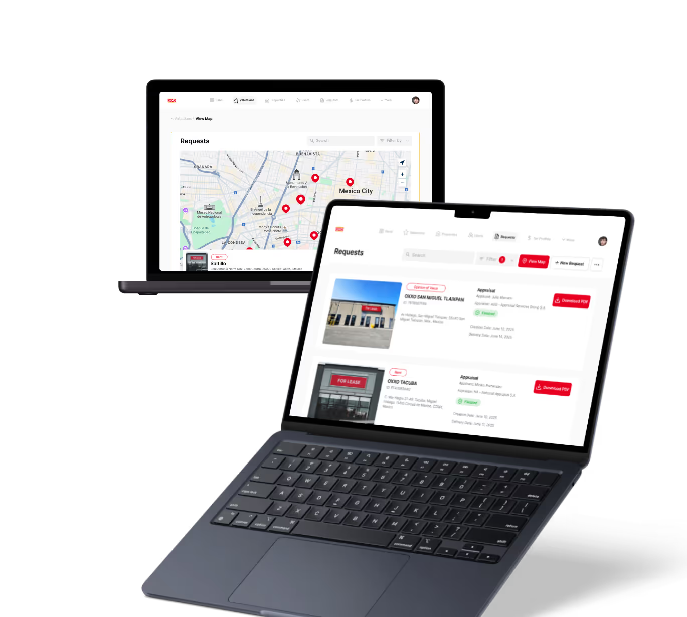
Product Metrics Dashboard in Product Analytics
Product Management
Learn how a product metrics dashboard helps track key data to improve product decisions and user experience effectively.
Raw data does not make decisions easier. A well-built product metrics dashboard does. It puts the right numbers in front of the right people at the right time so decisions happen faster and with better evidence.
Without a shared dashboard, product teams make decisions from different data sets, reach different conclusions, and spend more time debating numbers than acting on them.
Key Takeaways
- A dashboard shows the health of your product at a glance: it aggregates key metrics into a single view that prevents critical signals from getting buried in raw data.
- Not every metric belongs on a dashboard: a cluttered dashboard is as unhelpful as no dashboard; only metrics that drive decisions should be included.
- Dashboards must be updated automatically: manual dashboards get stale within days and stop being trusted by the teams that depend on them for decisions.
- Different audiences need different dashboards: executive dashboards show high-level outcomes; team dashboards show the operational metrics engineers and product managers need daily.
- Dashboards should trigger action: a number on a dashboard that nobody knows how to respond to does not belong there regardless of how interesting it is.
- Review cadence matters: a dashboard that nobody checks regularly stops being a decision tool and becomes a reporting artifact that adds no value.
What Is a Product Metrics Dashboard?
A product metrics dashboard is a centralized visual display of the key performance indicators that measure whether a product is healthy, growing, and delivering value. It aggregates data from multiple sources into a single view updated automatically on a defined schedule.
The dashboard is the difference between a product team that reacts to problems and one that sees them coming.
- Health indicators: retention rate, active user counts, activation rate, and churn rate give a real-time view of whether the product is working for the users who have it.
- Growth signals: new user acquisition, trial conversion rate, and expansion revenue metrics show whether the product is growing its user base effectively.
- Engagement metrics: session frequency, feature adoption rates, and time-in-app reveal how deeply users are integrating the product into their daily workflows.
- Business impact metrics: revenue per user, net revenue retention, and customer lifetime value connect product health to the financial outcomes leadership cares about most.
A dashboard without business impact metrics is an engagement report. A dashboard without engagement metrics is a finance report. Both are incomplete and lead to incomplete decisions.
Which Metrics Should Be on a Product Dashboard?
A product dashboard should include the five to ten metrics that most directly measure whether the product is achieving its goals. Start with activation rate, day-seven retention, feature adoption, and churn rate. Add revenue metrics when those are directly influenced by product decisions.
Fewer metrics on a dashboard is almost always better. Every additional metric dilutes attention and makes it harder to identify which signals actually need a response.
- Activation rate: the percentage of new users who complete the defined first value action; directly measures whether onboarding is working and predicts downstream retention.
- Day-seven and day-thirty retention: the share of activated users who return after one week and one month; the strongest proxy for whether the product creates lasting habits.
- Feature adoption rate: the percentage of active users engaging with specific features; reveals whether new functionality is reaching the users it was built for.
- Monthly active users: the count of users who used the product at least once in the last 30 days; the most widely used benchmark for overall product health over time.
Understanding which metrics signal product-market fit versus which are vanity metrics helps teams build dashboards that surface real signal rather than impressive-looking but decision-irrelevant numbers.
How Should a Product Dashboard Be Structured?
A well-structured product dashboard organizes metrics into clear sections by type, uses trend lines rather than point-in-time snapshots, includes period-over-period comparisons, and applies visual hierarchy to make the most critical metrics immediately obvious without requiring interpretation.
Structure determines whether a dashboard gets used. A poorly organized dashboard gets glanced at and ignored; a well-organized one becomes the first place teams look when making decisions.
- Group by metric category: separate health metrics from growth metrics from engagement metrics so users know where to look for specific signal types without scanning the entire dashboard.
- Use trend lines over single data points: a single number tells you where you are; a trend line tells you where you are going, which is the information that actually drives timely decisions.
- Add period-over-period comparison: showing week-over-week or month-over-month change for each metric helps teams distinguish normal variation from meaningful shifts that require investigation.
- Highlight metrics outside acceptable range: automated alerts or visual indicators that flag metrics outside their normal range prevent critical signals from being buried in data that otherwise looks acceptable.
At LOW/CODE Agency, we build automated dashboard infrastructure into every product we launch so teams have reliable, up-to-date metrics from the first day of production use rather than retroactively building reporting systems weeks later.
How Do Product Teams Use Dashboards to Make Better Decisions?
Product teams use dashboards by reviewing key metrics on a regular cadence, identifying the metric furthest from its target, investigating the behavioral data behind it, and using that investigation to inform the next sprint's prioritization decisions.
A dashboard changes nothing if nobody acts on what it shows. The value is in building a review habit that connects dashboard signals to product decisions reliably.
- Weekly metric review: a brief 30-minute weekly dashboard review by the product team keeps everyone oriented to the same health signals and catches negative trends before they become serious retention problems.
- Metric ownership assignment: assigning specific team members ownership of specific dashboard metrics creates accountability and ensures that signals do not fall through the cracks during busy delivery periods.
- Alert threshold configuration: automated alerts that fire when a metric crosses a defined threshold mean the team does not have to check manually to catch problems early enough to respond effectively.
- Decision log connection: recording which dashboard signals triggered which product decisions creates a feedback loop that makes the team better at interpreting data over time.
Teams that build a dashboard-to-decision habit consistently outperform teams that treat analytics as a reporting function rather than a decision support system.
Conclusion
A product metrics dashboard is only as valuable as the decisions it enables. Building a good one is the easier part. Building a team culture that uses it to drive consistent action is what separates data-informed product organizations from data-rich but decision-slow ones.
Get the right metrics, keep the dashboard clean, review it regularly, and make sure every number on it is connected to something your team can actually do.
At LOW/CODE Agency, we've helped 450+ clients build and scale digital products. Our clients include global brands like Medtronic, American Express, Coca-Cola, Zapier, and Sotheby's.


%20(Custom).avif)
FAQs
What is a product metrics dashboard?
Which metrics should be on a product dashboard?
How many metrics should a product dashboard have?
What tools are used to build product dashboards?
How often should a product team review its dashboard?
What is the difference between a product dashboard and a business dashboard?
Related Terms
See our numbers
315+
entrepreneurs and businesses trust LowCode Agency
Investing in custom business software pays off
We were managing property valuations across multiple brands, and the complexity was overwhelming our traditional processes. Every day of delay in property evaluation meant potential lost revenue and competitive disadvantage.
15,000+
property valuations managed through centralized platform
40%
reduction in valuation processing time

J.Antonio Avalos
,
Product Manager Lead
OXXO