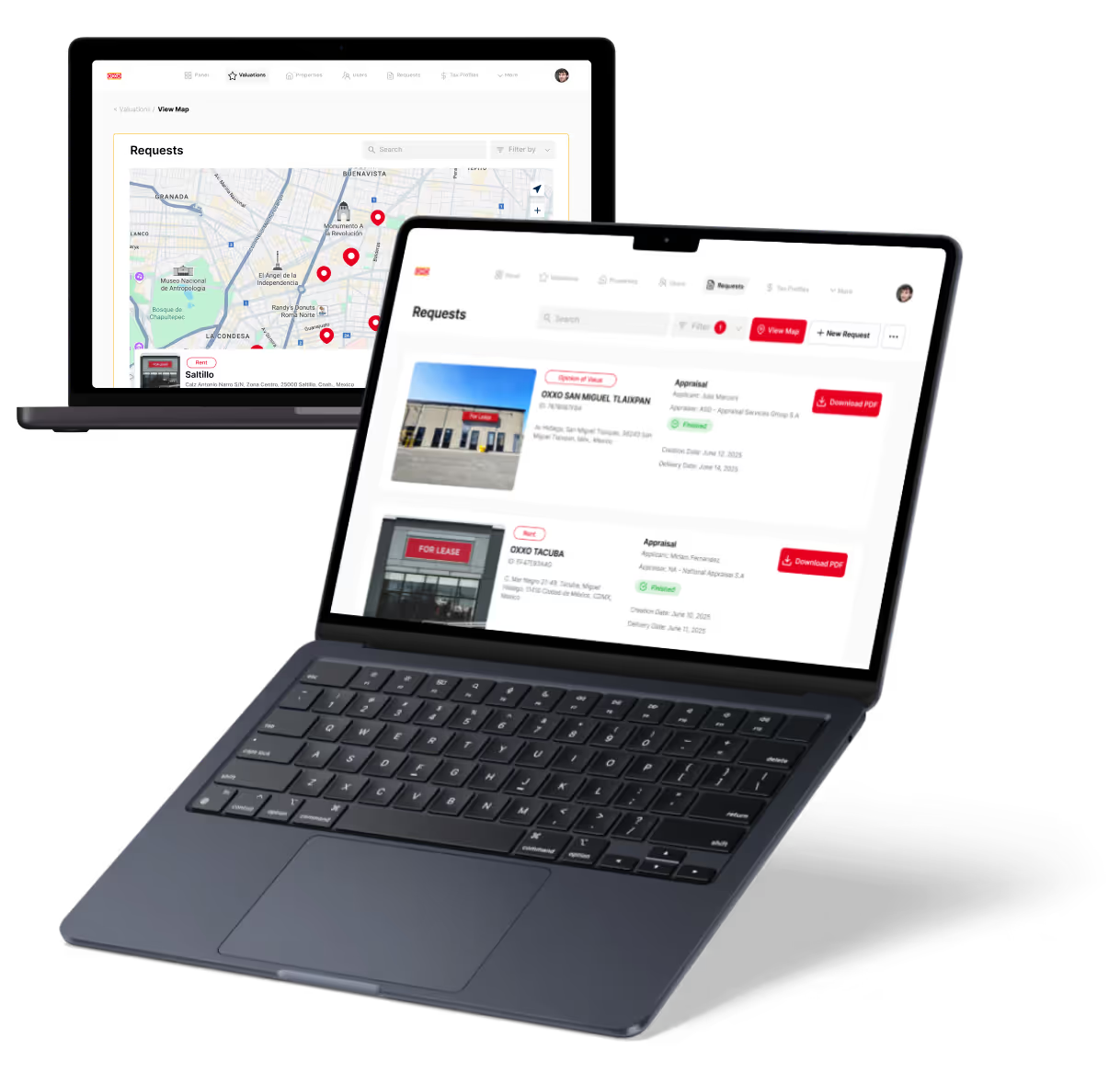
Website Redesign Before and After Examples
Real website redesign before and after examples showing what changed, why, and what measurable results followed the redesign.

Website redesign before and after examples are the most honest argument for investing in a professional redesign.
A side-by-side comparison of a homepage that couldn't convert a visitor to a focused, mobile-optimized experience with a clear CTA does more persuading than any case study summary ever could.
The best examples combine visual transformation with performance data. Seeing the old navigation, then the new one, and then reading that form completions increased 43% in the first 90 days answers the real question: does redesigning actually work, and what kind of results should you expect?
Key Takeaways
- Metrics make examples meaningful: The most compelling before-and-after examples pair visual comparison with specific conversion, traffic, or lead volume data to prove impact.
- Pattern recognition accelerates your brief: Studying examples from your industry helps identify which specific changes are most likely to improve your own site's performance.
- Homepages deliver the most dramatic results: The pages with the highest before-and-after impact are consistently the homepage, primary service pages, and site-wide navigation.
- Mobile transformation is visually striking: Sites redesigned from desktop-first to mobile-first show the most dramatic visual before-and-after comparisons of any site type.
- Strategic reasoning is more useful than visuals: The most instructive examples explain why specific changes were made, not just what they look like as finished screenshots.
What Great Before-and-After Examples Include
Not all before-and-after examples are equally instructive. The ones that teach you something useful contain three things: the visual comparison, the problem statement, and the strategic reasoning.
Examples that show only design screenshots without context are portfolio pieces, not learning tools. For detailed website redesign case studies that go deeper, the baseline data and decision rationale are always the most valuable sections.
Visual Comparison Plus Performance Data
The most useful before-and-after examples go beyond screenshots to include conversion rate changes, traffic volume shifts, bounce rate improvement, or lead generation impact. Without the data, you can't evaluate whether the redesign worked.
- Before data is required for comparison: A case study without documented baseline metrics cannot make a credible claim about what the redesign actually improved or by how much.
- Specific metrics beat general claims: "Conversion rate increased from 1.2% to 2.8%" is instructive. "Improved conversions significantly" teaches nothing about what to expect from your own redesign.
- Multiple metrics tell a fuller story: A traffic increase alongside a conversion rate improvement is much stronger evidence of redesign success than either metric alone provides.
Look for examples that name specific numbers and specify how long after launch they were measured.
The Problem Statement: What Was Wrong Before
Understanding what specifically wasn't working before the redesign is essential context. The best examples describe the problem being solved, not just the aesthetic shift between old and new.
- Problems described with specificity are more useful: "The mobile checkout flow had a 78% abandonment rate" is a learnable problem statement. "The old site looked dated" is not useful context.
- User research findings make examples credible: Before-and-after examples that reference specific user testing findings or analytics data to describe the original problem have demonstrably informed redesign decisions.
- Matching problems to your own site: The most useful examples are those where the before-state problem closely mirrors an issue you recognize on your own site right now.
Strategic Decision Explanation
The most instructive examples explain why specific changes were made: why navigation was restructured, why the CTA moved, why the color palette changed. These explanations provide learnable frameworks, not just visual inspiration.
- Decision rationale is the transferable part: Understanding why a navigation was simplified from eight sections to four gives you a principle to apply, not just an outcome to admire.
- Design choices should trace to user research: When an example explains that a CTA was repositioned because scroll depth data showed users weren't reaching it, that's an insight you can apply immediately.
- Before-and-after with no explanation is just art: Visual transformation without strategic reasoning is inspiring for designers and useless for the business owners making redesign investment decisions.
Brand Transformations in Before-and-After Examples
When studying brand redesigns before and after, the most dramatic transformations happen when the old visual identity was actively undermining the positioning the company was trying to hold.
Professional Services Brand Transformations
The typical before-and-after for professional service firms moves from text-heavy, template-looking sites to clean, authority-signaling designs with strong photography and clear positioning. The conversion rate and inquiry volume changes that follow are consistently significant.
- Authority signals are visual, not textual: A professional services site that looks like a template cannot claim authority through copy alone. Design must signal expertise before the visitor reads a word.
- Photography investment shows in results: Professional services firms that replaced stock images with real team photography consistently report higher time on site and improved inquiry form completion rates.
- Positioning clarity drives lead quality: Sites that moved from generalist to specialist positioning through their redesign typically see fewer but higher-quality inquiries, improving sales efficiency substantially.
SaaS and Technology Brand Redesigns
The characteristic evolution of B2B tech companies moves from feature-list-heavy product sites to story-driven, problem-first narratives with clear audience segmentation. Pipeline impact and trial conversion metrics typically justify the investment within two quarters.
- Problem-first narratives convert better: SaaS sites that lead with customer problems rather than product features consistently outperform feature-first sites on demo request and trial signup conversion metrics.
- Audience segmentation reduces bounce rate: Clear pathways for different user types (by role, company size, or use case) reduce homepage bounce rates as visitors quickly find a path relevant to them.
- Trial conversion is the primary metric: For SaaS redesigns, the primary before-and-after metric is trial or demo conversion rate, and well-executed redesigns typically show 30-60% improvement within six months.
Local Business and Service Brand Transformations
The typical before-and-after for local service businesses moves from DIY-looking sites with unclear contact options to professional, mobile-optimized sites with prominent CTAs and clear trust signals.
- Mobile optimization delivers the most immediate gains: Local service businesses capture the highest proportion of mobile search traffic. A mobile-first redesign often produces double-digit call volume increases within weeks.
- Trust signals are conversion levers: Reviews, certifications, before-and-after photography of work completed, and clear guarantees transform conversion rates on service pages when positioned prominently.
- Prominent contact options reduce friction: Local service sites that moved primary contact options above the fold and added click-to-call buttons consistently show measurable call volume improvement post-redesign.
UX Improvements in Before-and-After Examples
When examining UX improvements from website redesigns, navigation architecture and mobile experience transformations produce the most consistent and measurable improvements across industries and site types.
Navigation Architecture Transformations
Navigation redesigns from overwhelming mega-menus to clean, audience-segmented navigation consistently produce meaningful bounce rate and task completion improvements. The before-and-after comparison here is often the most instructive structural change in the entire project.
- Audience-first navigation outperforms feature-first: Navigation organized around user goals ("I want to..." or segmented by audience type) consistently outperforms navigation organized by the company's internal service categories.
- Fewer items means better task completion: Navigation menus reduced from twelve to five or six primary items show measurable improvement in task completion rates in every documented case study that tracks this metric.
- Navigation changes require user testing: The most successful navigation before-and-afters were validated with card sorting or tree testing before build. Untested navigation assumptions often produce redesigns that replicate the original problem.
Mobile Experience Transformations
The before-and-after for sites that moved from desktop-first to mobile-first design is often the most visually dramatic comparison in any redesign portfolio.
Mobile conversion rate lifts of 40-80% are a typical result for well-executed mobile-first redesigns.
- Desktop-first mobile adaption always underperforms: A desktop layout compressed to fit a mobile screen cannot match a layout designed for mobile interaction patterns from the very beginning of the design process.
- Thumb-zone design changes completion rates: Forms and CTAs designed for thumb-reach on a mobile screen show dramatically higher completion rates than the same elements placed in desktop-convenient screen positions.
- Mobile checkout transformation is most dramatic: Ecommerce sites that redesigned checkout specifically for mobile typically show the highest before-and-after conversion lift of any page type across the entire site.
Form and Checkout Simplification
Before-and-after examples of form redesigns reducing fields from 12 to 4, removing required account creation, and adding progress indicators show form completion rate improvements of 20-60% in documented cases.
- Every additional field reduces completion rate: Documented before-and-afters consistently show that removing a required field increases completion by 5-10%; the cumulative effect of removing four fields is substantial.
- Required account creation abandons users: Removing mandatory account creation before checkout or inquiry form submission is one of the single highest-ROI changes visible in before-and-after ecommerce data.
- Progress indicators improve completion on longer forms: Multi-step forms that added a visible progress bar showed meaningfully higher completion rates in before-and-after examples across B2B and institutional site types.
Conversion Improvements in Before-and-After Examples
When analyzing conversion gains from site redesigns, the homepage CTA architecture and service page structure produce the most directly measurable and consistently documented improvements.
Homepage CTA Transformation Examples
Before-and-after examples of homepage conversion architecture show sites that changed from generic "Contact Us" CTAs to specific, outcome-focused offers.
The conversion rate lift from this single change is often the most significant metric in the entire case study.
- Specific CTAs outperform generic ones: "Get Your Free SEO Audit" consistently outperforms "Contact Us" on conversion rate because it tells the visitor exactly what they will receive by clicking.
- CTA position before the fold matters: Moving the primary CTA above the fold on mobile, where the majority of traffic now arrives, is one of the most consistently documented before-and-after wins.
- Single primary CTA reduces decision friction: Homepages with one clear primary action outperform those with three or four competing CTAs; choice reduces conversion by forcing unnecessary decisions.
Service Page Redesign and Lead Generation Impact
Service page redesigns that added social proof above the fold, simplified page structure, and replaced vague "learn more" links with specific action offers consistently show significant inquiry volume increases in before-and-after documentation.
- Social proof above the fold changes initial trust: A testimonial, client logo, or review count placed near the top of a service page changes the visitor's trust level before they've read the service description.
- Simplified page structure reduces drop-off: Service pages reduced from 1,500 words to 600 focused words with clear section headings show lower bounce rates and higher scroll depth to the conversion CTA.
- Specific action offers convert better: "Book a 30-minute strategy call" converts at a higher rate than "contact us" because it removes ambiguity about what the next step actually involves.
Pricing Page Transformation Examples
Before-and-after pricing page redesigns moving from single-option to three-tier pricing, adding social proof near the purchase button, and reducing decision points show both conversion rate and average order value improvements.
- Three-tier pricing anchors value perception: Moving from a single price to three tiers typically improves conversion rate by making the middle option feel both accessible and justified through comparison.
- Social proof near the purchase button matters: A testimonial or trust signal placed within two seconds of scroll reach from the pricing CTA reduces the trust barrier at the exact moment of decision.
- Reducing decision points increases completion: Pricing pages that simplified from eight plan options to three showed higher total conversion rates, even though the number of available choices for buyers decreased.
Design Trends Visible in Before-and-After Examples
When observing design trends driving website improvements, the same visual patterns appear consistently across successful before-and-after examples regardless of industry, company size, or platform.
From Cluttered to White Space-Driven Layouts
The most common visual transformation in before-and-after examples is reduction of visual noise: increased white space, reduced color count, simplified typography, and fewer competing elements on any given screen.
- White space is not wasted space: Sites that increased white space between elements showed measurable improvements in readability metrics and time on page, not just aesthetic improvement.
- Color reduction builds visual hierarchy: Moving from six brand colors to two or three primary palette colors creates clearer visual hierarchy and makes CTAs more identifiable by contrast.
- Typography simplification improves trust: Sites that reduced from four or five typefaces to one or two consistently show improvement in the "professional" and "trustworthy" perception ratings in user surveys.
From Stock Photography to Authentic Visual Content
The transformation from generic stock imagery to authentic photography consistently improves trust metrics and time on page, even when the authentic photography is not technically perfect compared to stock alternatives.
- Real photography converts better than perfect stock: Authentic team, facility, and product photography outperforms high-production stock imagery on trust and engagement metrics in every documented before-and-after study.
- Stock photography signals low investment: Visitors recognize commonly used stock images and interpret them as evidence that the company hasn't invested in its own presentation or doesn't have real work to show.
- Authentic content builds specific trust: A real photo of an actual team member in a real workspace communicates something a stock image of a smiling professional at a laptop cannot replicate.
From Desktop-Centered to Mobile-First Design
The visual transformation patterns characterizing mobile-first redesigns include larger text, simplified navigation, prominent click-to-call buttons, and hero sections that communicate full value within a small viewport.
- Large text on mobile reduces friction immediately: Moving from 14px body text to 16-18px on mobile reduces the reading effort that causes visitors on small screens to leave rather than engage.
- Simplified navigation becomes a full-screen experience: Mobile navigation that reveals a clean full-screen menu replacing a cramped collapsed header shows consistent improvement in navigation engagement rates.
- Hero sections that work on mobile convert better: Before-and-afters consistently show that hero sections redesigned to communicate the primary value proposition within a 375px viewport outperform desktop-first versions on mobile conversion.
What to Expect from Your Own Redesign
Before translating before-and-after examples into expectations for your own project, consider website redesigns for business founders to understand how starting point, budget, and business model affect the results a redesign is likely to produce for your specific situation.
Setting Realistic Improvement Expectations
Use before-and-after data from comparable industries and site types to set realistic improvement targets. Well-executed redesigns typically show 20-40% improvement in primary conversion metrics, with significant variation based on how underperforming the original site was.
- Starting point determines ceiling for improvement: A site converting at 0.3% has more room for improvement than one converting at 2.5%. The lower the baseline, the higher the potential percentage improvement.
- Industry benchmarks calibrate expectations: Research average conversion rates in your specific industry and use them alongside before-and-after examples to set targets grounded in comparable data.
- Timeline for results varies by metric: Some improvements appear within days of launch; organic traffic changes from SEO work may take 3-6 months to fully reflect the redesign's impact.
Identifying the Highest-Impact Changes for Your Site
Audit your current site against the patterns visible in before-and-after examples to identify which specific changes are most likely to move your primary metrics.
Navigation, mobile experience, and CTA architecture are the highest-impact areas for most sites.
- Analytics identify your highest-impact pages: Your highest-traffic pages with the highest bounce rates are the most valuable places to focus redesign attention and effort.
- Mobile performance is your starting point: Check your mobile conversion rate against desktop. A significant gap between the two identifies mobile experience as the highest-leverage redesign priority.
- CTA analyzis reveals conversion architecture gaps: Map every CTA on your current site and evaluate whether it has a specific value offer, visible placement, and adequate contrast against its background.
From Inspiration to Brief
Translate before-and-after inspiration into a project brief by documenting the specific problems your site has, the outcome metrics you want to improve, and the design direction you're drawn to from examples you've collected.
- Document problems before solutions: A brief that starts with "we want our site to look like this example" will produce a different redesign than one that starts with "our mobile bounce rate is 78% and our CTA is below the fold."
- Name three specific metrics to improve: Choose conversion rate, organic traffic, or engagement metrics as defined targets. A redesign without defined success metrics cannot be evaluated after launch.
- Collect examples that match your ambition: Before-and-after examples from companies with comparable resources and site complexity are more useful references than aspirational examples from organizations with significantly larger budgets.
Conclusion
The most valuable lesson website redesign before and after examples teach is that dramatic transformation comes from solving specific user problems, not from applying more visual polish to a site with structural issues.
The sites that generate the most striking before-and-after comparisons are the ones where the redesign addressed something that was genuinely frustrating or blocking users.
Find three before-and-after examples from companies in your industry or of a similar size. Write down the specific changes you wish your own site would make.
That's your redesign brief started, and it will be stronger than one written without that research behind it.
LOW/CODE Agency Creates Redesigns Worth Adding to Before-and-After Collections
LOW/CODE Agency builds redesigns that produce results worth documenting. Every engagement is measurement-framed: baselines are set before launch, performance is tracked after, and the results are documented in the kind of before-and-after case study that actually teaches something to whoever reads it.
We work as a strategic product team, not a dev shop. That means we don't just build a new look.
We solve the specific user experience and conversion problems the old site had, and we measure whether the solutions worked.
- Performance baselines set before every launch: We document pre-launch metrics across traffic, conversion, and engagement so post-launch improvement data is accurate and comparable.
- Conversion architecture in every project: Every redesign includes CTA analyzis, user flow optimization, and conversion rate improvement as defined outcomes, not optional extras.
- Mobile-first design standard: Every site we build is designed from the smallest viewport outward, producing the mobile experience improvements most visible in before-and-after comparisons.
- UX research informs every design decision: Navigation, page structure, and content hierarchy decisions trace to user research and analytics data, not aesthetic preference or stakeholder opinion.
- Post-launch measurement program: Our post-launch monitoring window documents early wins and catches technical issues before they affect performance data or organic rankings.
- Design system delivery: Every project delivers a design system that makes the site maintainable and provides the visual consistency that makes before-and-after comparisons most compelling.
- Case study documentation built in: We help clients document the redesign story for their own announcement campaigns and internal stakeholder reporting.
We deliver professional website redesign services for clients including Coca-Cola, American Express, Sotheby's, Medtronic, Zapier, and Dataiku, across 450+ products built. Start with a scoping call to discuss what results your redesign should be aiming for.
Last updated on
July 10, 2026
.