Top B2B Website UIUX Design Principles
Discover key UIUX design principles for B2B websites to enhance user experience and boost conversions effectively.

The most common mistake in B2B website design is applying B2C design thinking to a B2B audience. B2B website UI/UX design principles that work are those designed for deliberate, high-stakes evaluation, not visual excitement or emotional activation. B2B buyers are evaluating vendors across multiple touchpoints, over weeks or months, with multiple stakeholders involved. The design decisions that matter are those that help them find what they need, assess fit, and take a next step.
This article covers the UI/UX principles that actually move B2B buyers through a site toward a conversation, not the ones that generate visual interest at the expense of evaluation clarity.
Key Takeaways
- B2B UX is evaluation design, not engagement design the goal is to help a deliberate buyer find information they need quickly, not to maximize time-on-site or visual novelty.
- Navigation is the single most important UX decision enterprise buyers who cannot find what they need within two clicks leave; navigation must reflect the buying journey, not the company org chart.
- Trust signals matter more than visual polish enterprise buyers evaluate credibility through case studies, client logos, team credentials, and data specificity, not animation quality or color palette.
- Mobile matters less than performance speed in B2B desktop usage dominates B2B browsing among senior decision-makers, but slow load times cost conversions across all devices.
- The CTA hierarchy is a structural decision, not a design decision primary, secondary, and passive calls to action must be sequenced for the buyer's readiness level, not placed wherever there is visual space.
- Accessibility is not optional ADA compliance is both a legal requirement and a conversion factor; inaccessible sites lose senior decision-makers and enterprise prospects in regulated industries.

How Do B2B Buyers Actually Move Through a Website?
B2B website sessions are not linear, enterprise buyers enter from multiple points, move based on their current evaluation question, and return multiple times before converting.
Multiple visits, multiple stakeholders: the average B2B purchase involves 6-10 decision-makers, each visiting the site with a different question. Understanding how B2B buyers move through a site across multiple sessions and stakeholders is the starting point for any navigation or page hierarchy decision.
What buyers do in the first 7 seconds: they determine whether the site is for them (ICP match), whether the company can solve their problem (value proposition clarity), and whether there is evidence it has done so before (social proof). If any of these fail, they leave.
The CFO is evaluating cost structure. The IT lead is evaluating integration. The end user is evaluating usability. Each arrives at the same site with a different evaluation question and a different tolerance for ambiguity.
B2B websites do not close deals, they qualify buyers into conversations. Design for the handoff moment (demo request, contact form, direct call) rather than for an immediate purchase decision.
Typical B2B buyers visit a site 3-7 times before converting. The site must be navigable on return visits, not just optimized for first impressions.
How Should B2B Website Navigation Be Designed?
The principles of B2B navigation design for buyers go beyond taxonomy, they require understanding the specific questions buyers have at each stage of the evaluation.
Every navigation item must answer a buyer question, not describe a company category, "Solutions by industry" answers a buyer question; "About our platform" describes a company category.
Navigation depth: maximum two levels. Mega-menus with four levels of hierarchy create cognitive overload for buyers already evaluating multiple vendors simultaneously.
The three essential navigation paths every B2B website needs: (1) by buyer role or industry ("I am a CFO / I am in manufacturing"), (2) by problem or outcome ("I need to integrate with my CRM / I need to improve conversion"), (3) by evaluation stage ("See our work / Read case studies / Get a demo").
Footer navigation: enterprise buyers use footers deliberately, for legal, compliance, team, and contact information. The footer is not an afterthought; it is a deliberate navigation stop for buyers doing due diligence.
Mobile navigation in B2B: hamburger menus compress navigation in ways that hide the second-level paths B2B buyers need. If critical secondary navigation items exist, consider a persistent sidebar or an alternative mobile navigation pattern.
How Should a B2B Website Be Structured Before Design Begins?
Information architecture must precede visual design, page hierarchy, content groupings, and user flow mapped against the buyer journey before anyone opens a design tool.
Architecture decisions made inside a design tool are made for visual reasons, not buyer reasons. The result is a layout that looks good but fails to serve the evaluation sequence buyers actually follow.
What wireframing accomplishes: wireframes test structure, not aesthetics. A low-fidelity wireframe of the homepage, key service pages, and conversion pages reveals whether the content hierarchy serves buyer evaluation. Changes at this stage cost hours; changes at development stage cost days.
The wireframing and prototyping process for B2B websites is distinct from B2C, it prioritizes evaluation clarity over engagement, and structural logic over visual interest.
The content-first vs design-first problem: B2B websites designed before copy is written produce layouts that cannot accommodate real content. The result is truncated messaging and homepage hero sections that say nothing specific.
When to prototype: interactive prototypes (Figma, InVision) are justified for complex user flows, resource hubs, partner portals, product configurators. For standard B2B websites, high-fidelity wireframes with placeholder copy are sufficient before moving to visual design.
What Visual Design Principles Matter Most for B2B Websites?
Four visual design decisions have the most direct impact on B2B buyer trust and conversion, and none of them is the one most design briefs lead with.
Typography hierarchy: enterprise buyers scan before they read. Typography hierarchy (H1 value proposition, H2 subheadings answering evaluation questions, body copy for depth) must be clear at a glance, not require effort to parse.
White space and cognitive load: complex B2B value propositions need visual breathing room. Dense pages presenting too much information simultaneously increase cognitive load and reduce the likelihood that any single message lands with the buyer.
Trust signal placement: client logos, case study references, outcome data, and security certifications belong above the fold on pages where buying decisions are being made, not in a carousel buried below the CTA.
Animation and movement: subtle motion (scroll-triggered fade, hover states) adds polish; heavy animation (full-screen video backgrounds, aggressive scroll effects) creates distraction and increases load time, both of which reduce B2B conversion.
The B2B website design trends worth adopting are those that improve evaluation clarity, not those that generate visual interest at the cost of content legibility.
How Should Calls to Action Be Structured on a B2B Website?
CTA structure is determined by buyer readiness, not by visual opportunity, three CTA levels match three stages of buyer evaluation, and applying the right level to the right page is what prevents the mismatch that costs conversions.
The three CTA levels: - Primary ("Book a Demo," "Request a Proposal"), for buyers who have completed their evaluation and are ready to engage. - Secondary ("Download a case study," "Watch a product walkthrough"), for buyers still in evaluation who are not yet ready to commit to a conversation. - Passive ("Read a related article," "Browse case studies"), for buyers in early research mode who need more information before any commitment.
Matching CTA to page intent: the homepage needs all three. A case study page needs a primary and secondary. A blog post needs a secondary and passive. A single primary CTA across all pages mismatches buyer readiness and reduces conversion.
CTA copy specificity reduces friction. "Book a Demo" outperforms "Get Started" because it specifies what the buyer will get. "See How It Works" outperforms "Learn More" for the same reason.
CTA placement: primary CTAs belong above the fold on conversion-intent pages (homepage, pricing, services). Secondary CTAs belong at natural content breaks. Passive CTAs belong at the end of long-form content.
Do not repeat the same primary CTA six times on a single page. One strong primary CTA, supported by a secondary, outperforms repetition. Repetition signals desperation to enterprise buyers and reduces perceived value.
What Accessibility Requirements Apply to B2B Websites?
WCAG 2.1 Level AA is the standard most B2B companies need to meet, and for enterprise sales, accessibility compliance is often a vendor qualification requirement, not just a legal consideration.
The standards and legal risk around B2B website ADA compliance are more specific than most marketing teams realize, understanding them before the build is significantly less expensive than addressing them after.
The commercial case for accessibility in B2B: enterprise procurement processes in regulated industries (healthcare, finance, government) often include accessibility compliance as a vendor requirement. A non-compliant site can disqualify a vendor from enterprise deals.
Key accessibility requirements for B2B websites: color contrast ratios (4.5:1 minimum for text), keyboard navigation support, alt text on all images, ARIA labels on interactive elements, and form field labels visible by default, not placeholder text that disappears on click.
Where B2B websites typically fail accessibility audits: heavy use of color to convey meaning, video without captions, PDF downloads without text equivalents, and pop-up modals without keyboard navigation support.
How to check: free tools (WAVE, Axe, Google Lighthouse) give an initial assessment. Automated tools catch approximately 30% of accessibility issues, a manual audit with assistive technology is required for the rest.
Conclusion
B2B website UI/UX design is not about visual creativity, it is about removing friction from an evaluation process that buyers are conducting deliberately, across multiple sessions, with multiple stakeholders. Every design decision should be tested against one question: does this make it easier or harder for a buyer to find what they need and decide whether to engage?
Audit your current website's navigation against the three buyer paths described in the navigation section, by role, by problem, and by evaluation stage. If your navigation does not map to at least two of these three, restructure before touching anything visual.
How LowCode Agency Approaches B2B Website Design
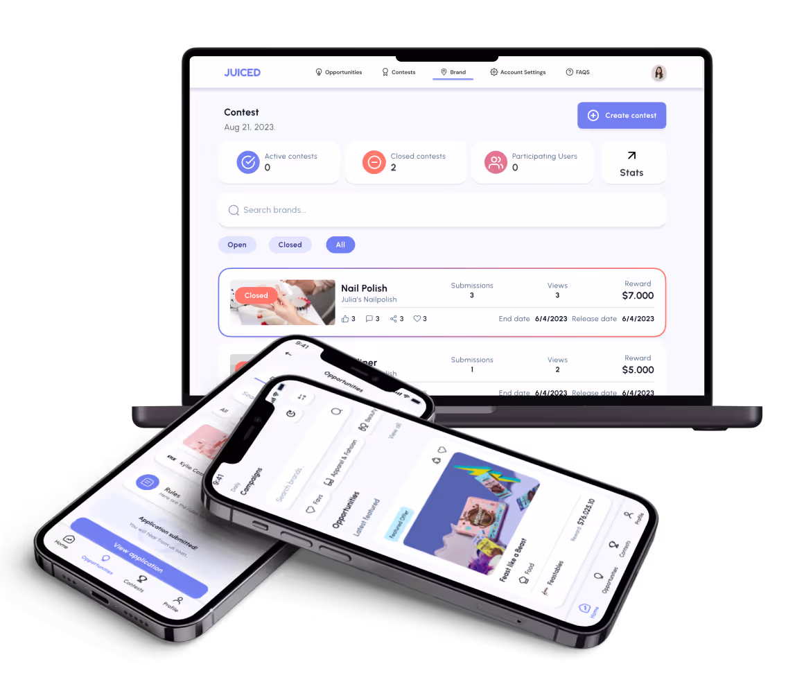
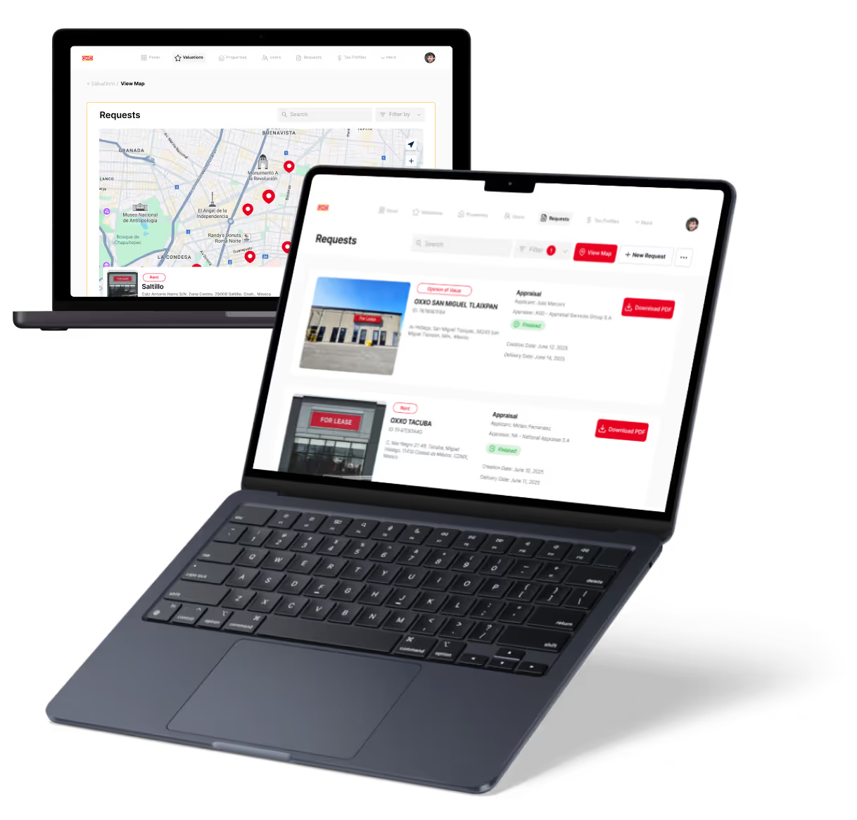
LowCode Agency designs B2B websites around how buyers evaluate vendors, not around how companies want to present themselves. Our B2B website development services integrate UX strategy, information architecture, and conversion design into a single process. See the approach in action through our client case studies, or get in touch to discuss your current site's evaluation experience and what would change.
- Buyer journey mapping documenting how each key stakeholder type moves through the site before any information architecture or navigation decisions are made (21 words)
- Information architecture design mapping page hierarchy and content groupings against the buyer evaluation sequence before wireframing or visual design begins (18 words)
- Navigation restructuring rebuilding navigation around the three buyer paths (role, problem, evaluation stage) rather than internal company structure or service taxonomy (19 words)
- Wireframe-first process producing low-fidelity wireframes of all key pages before visual design begins to validate structure with stakeholders before it becomes expensive to change (24 words)
- CTA hierarchy design sequencing primary, secondary, and passive calls to action by page intent and buyer readiness level, not by visual space availability (21 words)
- Trust signal placement integrating client references, outcome metrics, and social proof at the pages and positions where buyers are actively making evaluation decisions (21 words)
- Accessibility compliance review auditing against WCAG 2.1 Level AA requirements with automated tools and manual assistive technology testing before site launch (18 words)
We have built 350+ products for clients including Coca-Cola, American Express, Sotheby's, Medtronic, Zapier, and Dataiku.
Last updated on
June 11, 2026
.

Jesus is a visionary entrepreneur and tech expert. After nearly a decade working in web development, he founded LowCode Agency to help businesses optimize their operations through custom software solutions.

FAQs
What are the essential UIUX design principles for B2B websites?
How does B2B UIUX differ from B2C design?
Why is responsive design important for B2B websites?
What common UIUX mistakes should be avoided in B2B websites?
How can UIUX design improve lead generation on B2B sites?
Are there risks in overcomplicating B2B website design?
Related Articles

B2B Website
How to Build a B2B Website ROI Calculator
Learn step-by-step how to create a B2B website ROI calculator to measure your marketing impact and improve decision-making.
B2B Website
B2B Website CMS Guide for Non-Technical Founders
Learn how non-technical founders can choose the best B2B website CMS with this easy-to-follow selection guide.

B2B Website
Key Factors to Choose a B2B Website Development Agency
Discover what to consider when selecting a B2B website development agency to ensure quality, expertise, and ROI for your business.

B2B Website
How to Structure B2B Website Information Architecture
Learn effective strategies to organize your B2B website's information architecture for better user experience and higher conversions.